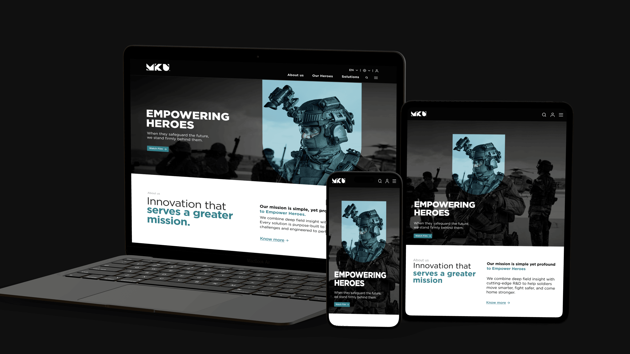
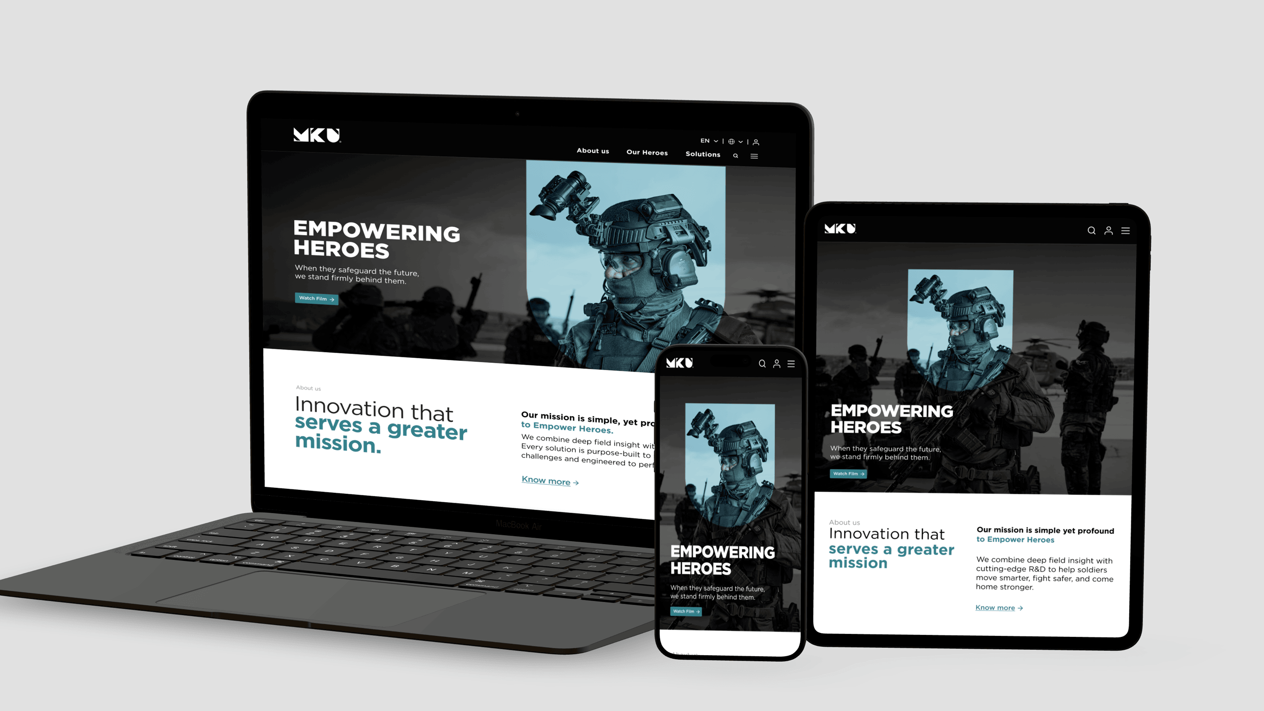
Case Study — MKU Website Redesign
New design language, navigation, catalog, and end-user pages for MKU's entire web presence — across Netro Optronics, Kavro Protection, and MRO.
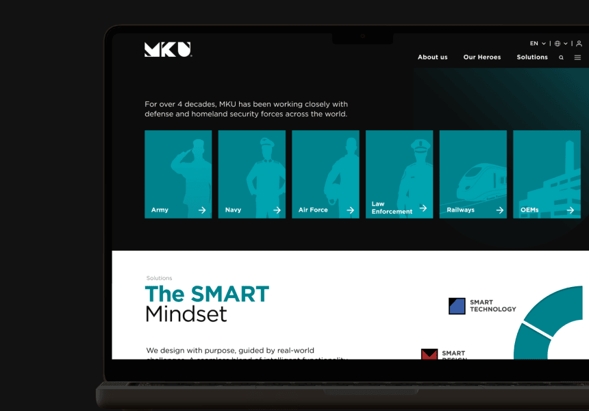
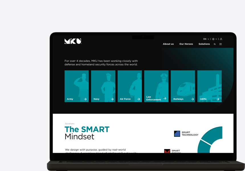
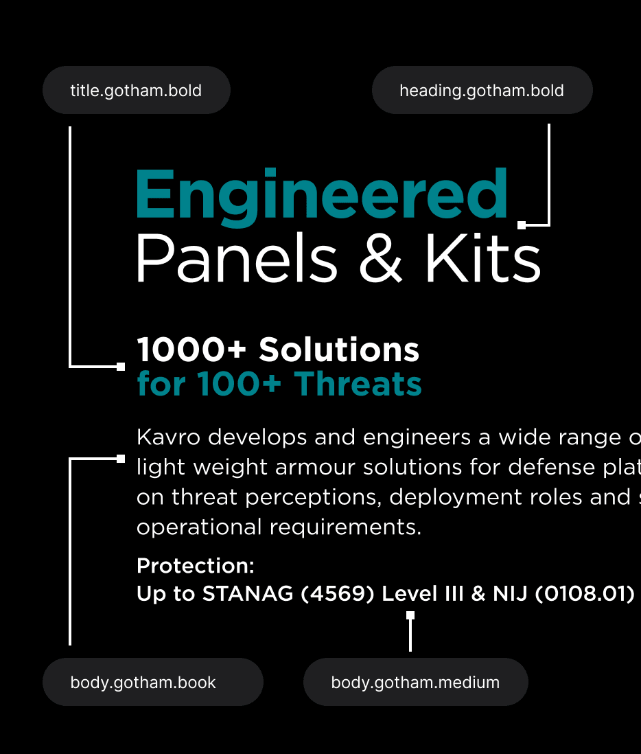
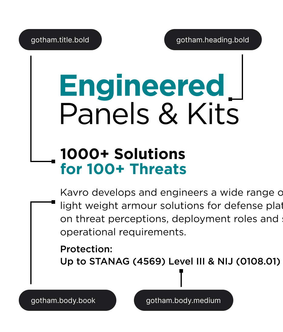
Design System
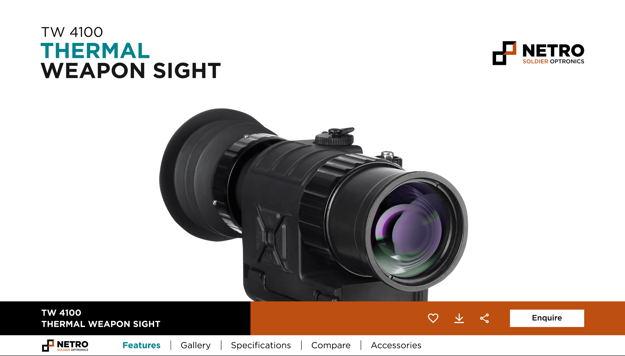
Product Page
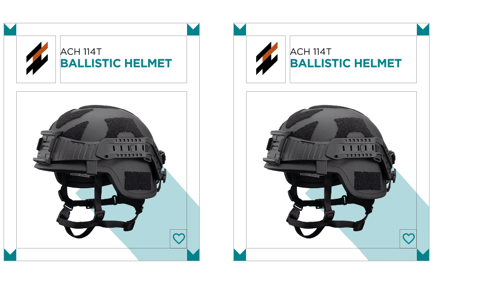
The old product pages had no consistent structure. Some had specs, some didn't. No way to tell sub-brands apart.
Catalog Page
The original catalog had no filters. Buyers scrolled a flat list to find what they needed. I added contextual filters, richer product cards, and an applied filters strip to make navigation faster and comparison effortless.
Three base filters always visible: Segment, Category, Sub Category. Deeper filters — Protection, Calibre, Fragmentation, Suspension — appear only when relevant to the selected subcategory.
Applied filter tags appear on each card and in the active filters strip — making it easy to see what's active and remove individual criteria at a glance.
The old site loaded one sub-category at a time. Selecting two meant browsing separately. The catalog now loads products across multiple sub-categories simultaneously.

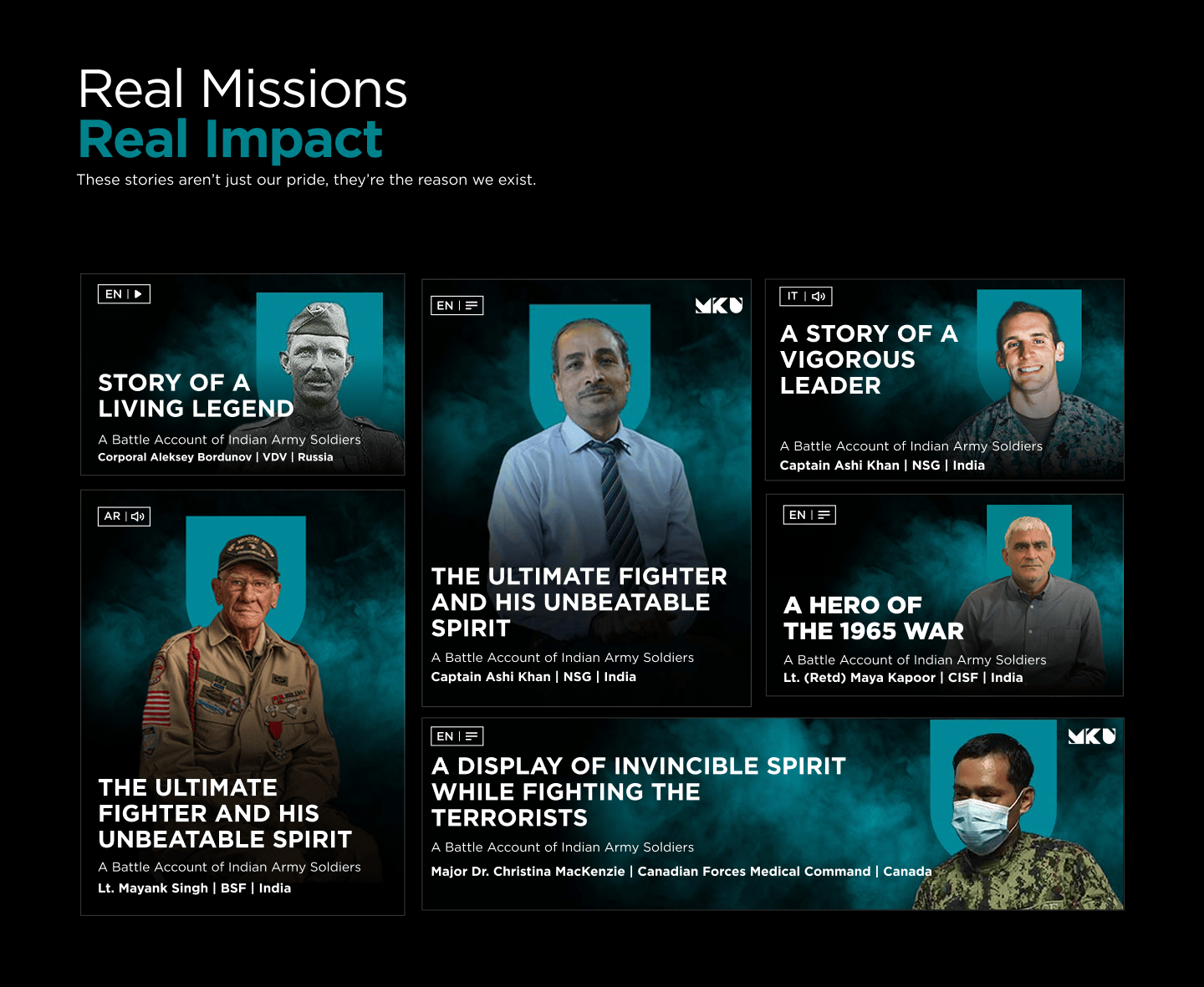
Heroes Program
The old product pages had no consistent structure. Some had specs, some didn't. No way to tell sub-brands apart.
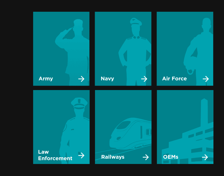
End User Page
MKU's products span three sub-brands. But an army personnel doesn't think in sub-brands. They need a helmet and a compatible night vision — one from Kavro, one from Netro. Previously, they had to find both separately and match compatibility themselves. End user pages put everything relevant to them in one place.
Products organised around who's using them, not who makes them. Each page surfaces only what's relevant to that segment — cutting through the sub-brand structure entirely.
Same product, reframed per segment. Imagery, copy, and use cases shift to match the buyer's world — building familiarity before they've read a single spec.
Related products surface together by default. No cross-referencing sub-brands, no manual spec matching. Shorter decision paths, lower drop-off.
Sales Pro
Browse projects60 Minutes to Ship: How a Sleeping TV Sparked a Better Event Experience
Read postsInteractive Demo
Select a sub-category to see contextual filters