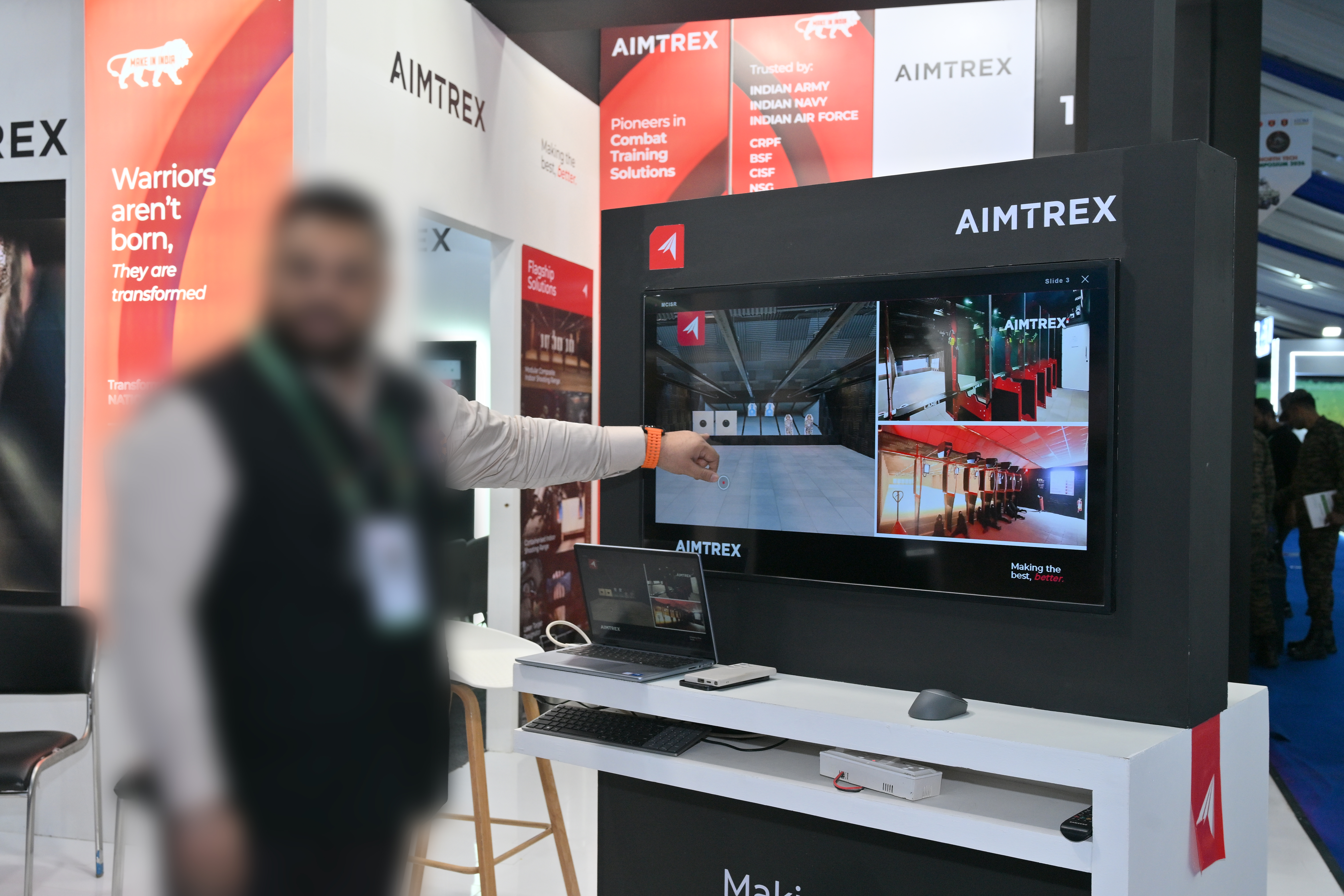
There's a specific kind of panic that hits when you're setting up a client's event booth an hour before doors open and you realize the TVs are going to be a problem.
Not broken. Not the wrong size. Just — sleeping. Every time nobody touched them for a few minutes, the screens would go dark, and a dark screen at a trade show booth looks like a booth that isn't ready. Or worse, a booth that doesn't care.
That was the first problem. The second one was more subtle, but arguably worse.
Two problems, both design problems
The plan for the booth was simple: sales reps would walk potential clients over to the screens and pull up a product presentation. Clean, professional, effective. Except the reality looked nothing like the plan. A rep would have to fumble to the desktop, find the right PowerPoint, open it, wait for it to load, then enter presentation mode — all while a potential client stood there watching. The transition from "nothing" to "presentation" had too many seams.
The dead state and the handoff state were both undesigned. Someone had thought carefully about the presentation decks. Nobody had thought about what happens before and after.
That's a UX problem. And UX problems have solutions.
Draft one: figure out the shape first
With about an hour on the clock, I opened a blank HTML file and started with structure. No branding yet — just trying to answer the question of what this thing needed to do. The first draft had a two-panel layout: a screensaver area on the left, a persistent sidebar on the right with a list of presentations and a resume button.
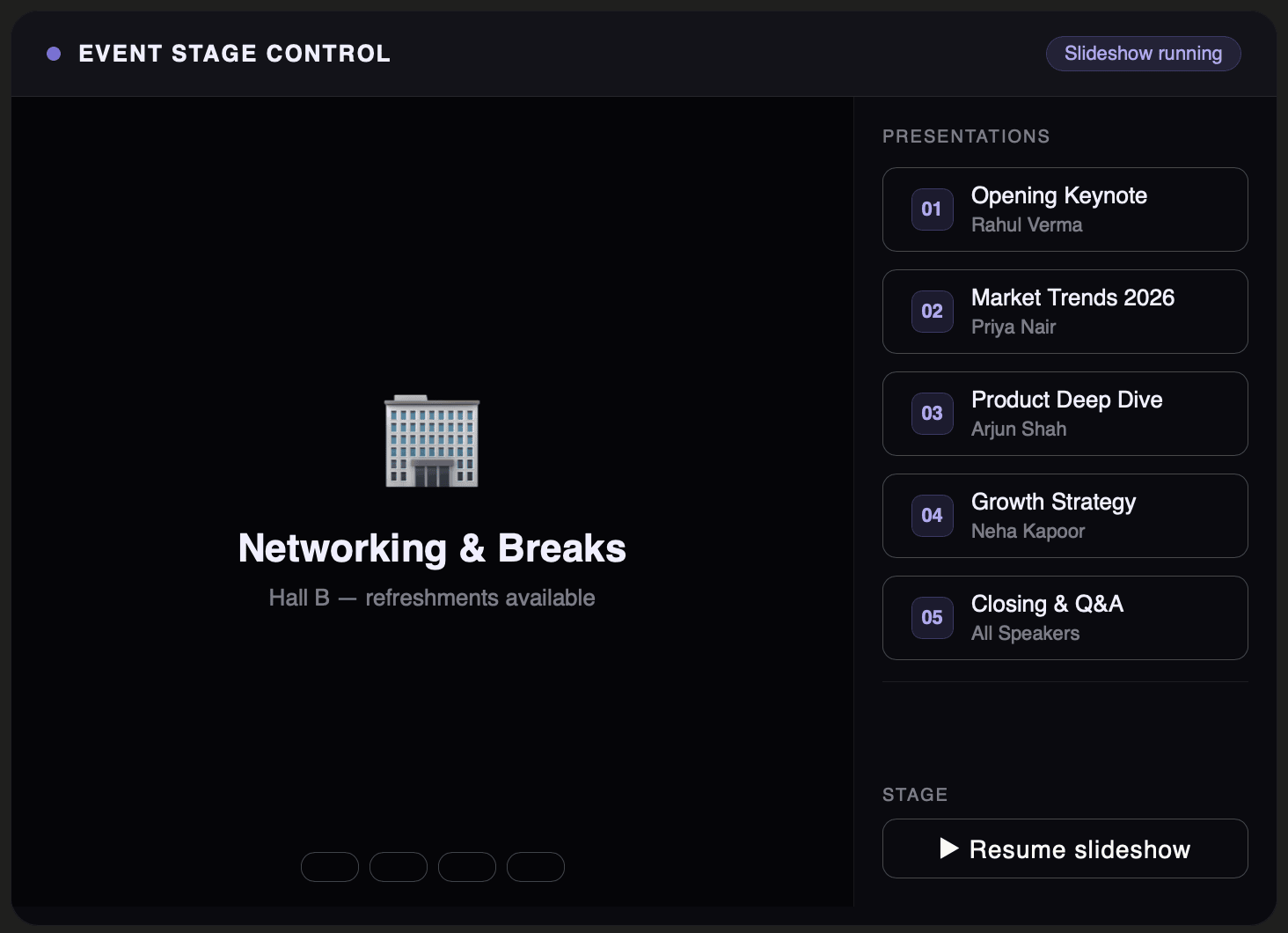
First draft. Generic, unbranded, but the layout logic is already there — screensaver on the left, presentation selector on the right.
It was rough. Placeholder content, no brand colours, no thought given to how it would actually look on a TV. But it answered the right question: the two-panel approach worked.
Then I looked at it again. The persistent sidebar felt like a kiosk. Everything visible all the time, no hierarchy, no moment of reveal. A booth TV shouldn't look like a government terminal. I scrapped the sidebar and moved the controls to the bottom — hidden by default, appearing only when the mouse moved.
The first real wall: PowerPoint doesn't open in a browser
The logical next step was embedding the actual presentations. The decks existed as .pptx files, so the first instinct was to load them directly. That doesn't work — browsers have no native way to render a PowerPoint file. Fine. Export them to PDF instead, load the PDF in an iframe.
Except Chrome blocks local PDF files loaded into iframes. It's a security restriction around local file access — the browser treats it as a potential attack vector and refuses to render it. We were running the whole thing from a local folder with no server, which meant this approach was dead on arrival.
Two dead ends in under twenty minutes.
The solution that actually worked
The fix was less elegant than we wanted but more robust than anything else: export every presentation slide as an individual PNG image, pull out any video slides as separate .mp4 files, and build a custom image viewer that loads them in sequence.
Each presentation became a numbered folder of images — 01.png, 02.png, 03.png. The viewer loads each image on demand, detects when a slide number is marked as a video, and switches to a <video> element instead of an <img>. Navigation works via arrow keys, spacebar, page up and down. Escape closes the presentation and returns to the screensaver instantly.
More prep work upfront, but once done the viewer was completely reliable — no security restrictions, no loading failures, no dependency on Chrome supporting a particular file format.
Bringing in the brand
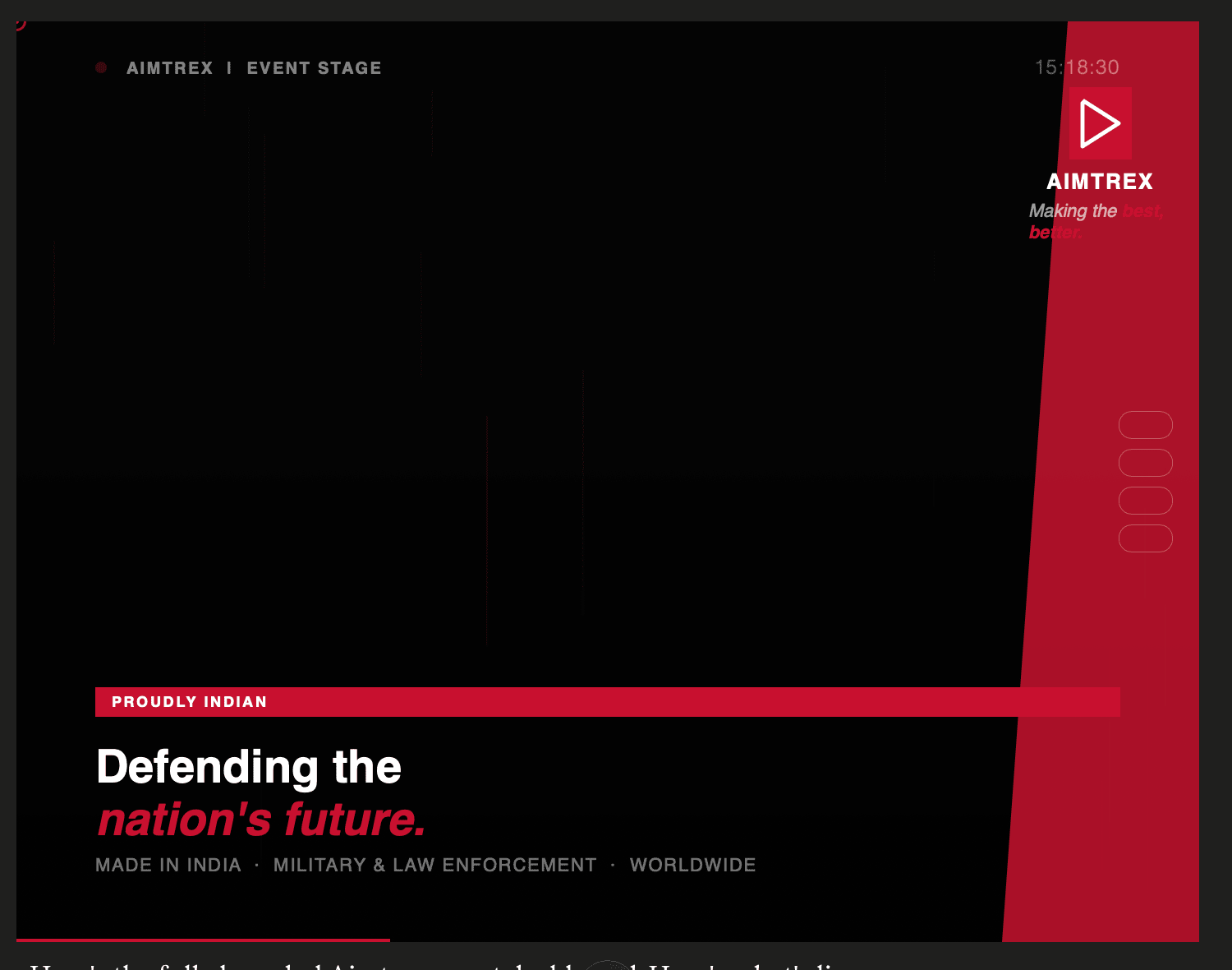
With the logic working, I brought in Aimtrex's brand identity. Their wordmark and logo icon locked to the screen corners, red accent colour for interactive states. The screensaver became a looping carousel of actual event and product imagery — fifteen slides, six seconds each, with a small circular progress indicator in the corner. The images did the work a solid colour never could: the screen looked alive even when nobody was at the booth.
The presentation selector moved to the bottom — cards in a row, hidden until the mouse moved, sliding up with a gradient behind them. Open a presentation and you're in a full-screen viewer with a thin branded top bar: the client's name, a live indicator dot, a slide counter. Close it and you're straight back to the screensaver. No desktop, no browser chrome, no visible transition.
First draft
Structure first. Two-panel layout, no branding, placeholder content.
Brand applied
Aimtrex identity applied. Bottom card selector, real screensaver background.
Final
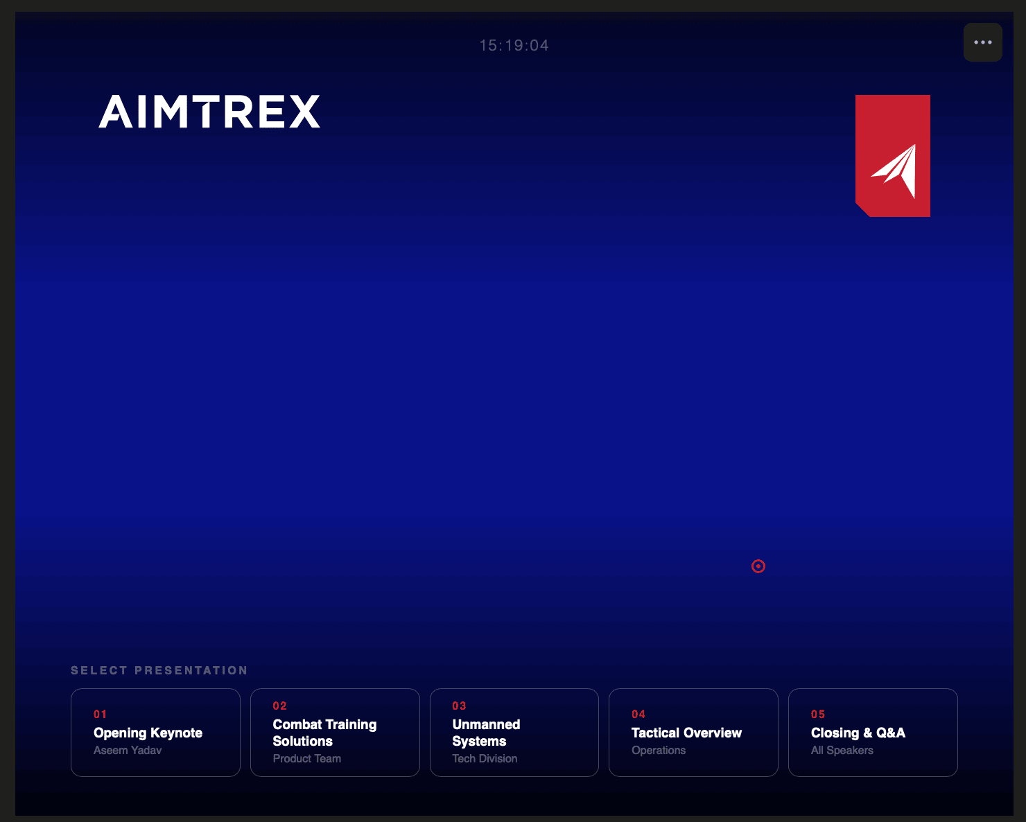
Sidebar gone. Controls slide up on mouse move. Presentation viewer locked in.
What shipped
By the time the event started, both screens were running. The screensaver cycled through brand imagery. A rep could walk a client over, move the mouse, tap a card, and be in a full-screen presentation in under two seconds. No visible desktop. No browser chrome. No waiting.
Screen recording of the final build — cursor movement reveals the controls, presentation opens full-screen.
A few people asked if it was a custom-built system.
It was a single HTML file and a folder of PNGs.
The takeaway
Events are a UX problem with a deadline you can't move. The booth, the flow, the moment a rep opens a presentation in front of someone — all of it is an experience, and all of it is design. Most of the time, the polished assets get the attention and the in-between moments get ignored. But those are often the moments that land hardest with the person standing there.
The sleeping TV forced a better solution than anyone had planned for. We hit two dead ends, had to throw out an approach we liked, and rebuilt from a less satisfying technical premise — but what shipped was cleaner and more reliable than the original plan would have been.
Sometimes the constraint is the design.
Download the event dashboard